UI design samples
The Stately dashboard + canvas editor show a personal aesthetic and how I've approached designing inherently complex tools.


Pared down without compromising expressivity, subtle in the details but focused in overall effect, bold in presentation of affordances yet able to be comfortably used throughout the day.
And especially in trying to balance a natural skill ramp from effective beginner to powerful expert.
A designer can jump in and easily sketch a user flow diagram, or an engineer with deep knowledge can deploy the diagram as production code synced with their GitHub codebase. In the same mode.
Here's a video of a splash screen for an unreleased product I'm currently working on.
I'm mainly a product designer, but here's a sample of my branding and marketing website work.

A few challenges that made Stately difficult to design were that states can nest, transitions can have the same properties as states, transition arrows can go underneath states, and content and UI elements are both "boxy".
I used a glass effect to help solve these problems.
You can read more about this work in a blog post I wrote.

I designed the color system for Stately. Because it applied in complex ways to user created content, I employed a perceptually uniform color space (HSLuv) so that any hue from each step would support the same contrast.
The exact lightness curve was refined while also working out a higher level semantic system for use in the app that fit our unique needs. These tokens took form of `type-role?-prominence?-modifier?` (like`bg-danger-secondary-hover`).

For variety, another (much simpler) design system I created was for the training app Teachably. Here was a quick reference that I made for the team.

Screenshots of Stately hardly show the complexity we had to distill, organize, and handle.
Here are a few early Figma sketches gesturing at our process of arriving at clarity by building prototypes of increasing fidelity.


And an annotated mockup that was pretty close to what we shipped for the overall structure (but not quite there yet).

What would an app be without a sign up page.

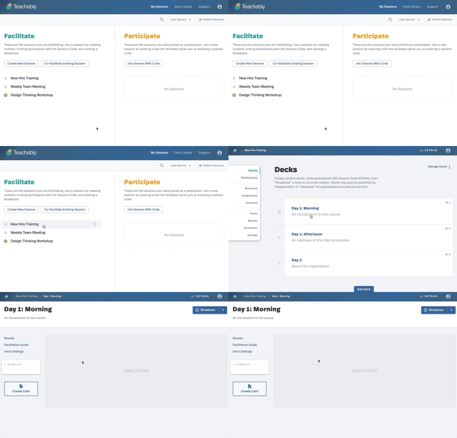
About 6 years ago, I built an app called Teachably for running remote workshops and training. It was notable for being far deeper and more flexible than any alternative while still being approachable. For just one example, you could click a button to instantly generate new activities based on live responses (guided by templates that you designed).
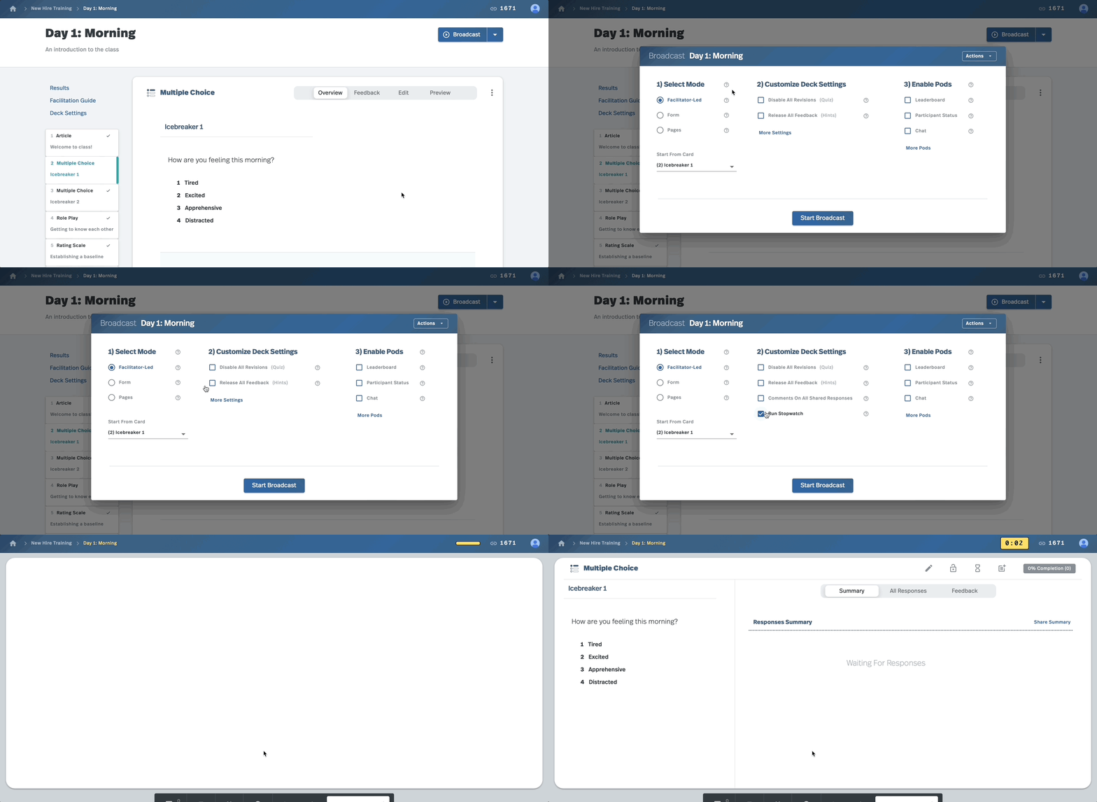
Here is a quick sample of Teachably.
You could either "facilitate" sessions or "participate" in them. If facilitating, you would create stackable "decks" of activity content. This let instructional design teams create several week training programs as a single, integrated deliverable.

When ready to begin facilitating, you would "broadcast" a deck to invited participants. Users appreciated the easy customization of each day's experience (and the smart defaults).

The group would do one activity at a time together. The facilitator would be walked through delivery of the content (which was often written by a different team). She could do things like share responses for discussion, vote on ideas, or play games on a leaderboard in a single click.

Participants would see one primary activity at a time during a synchronous session. But what made Teachably stand out was you could also "assign" decks as asynchronous work. So you didn't have to spend class time typing into boxes and could instead just broadcast a deck which had already been assigned.

One small interaction that ended up having a big impact was the "participant counter" for tracking participation. When you called on someone, you could tap the counter below their avatar. Then you could sort the participant list by that value to surface a lightweight recommendation for who to call on next.

The visuals are a bit dated (~2014/15), but here's some work with solid product design fundamentals that went on to be quite successful.
I was asked to help the CTO and other leaders re-imagine the operation of the company's core contact center business to be more effective.
Before our new design, agents worked like this.

Then after much prototyping, experience mapping, and traveling to contact centers around the country to talk to users and other stakeholders, I made this proposal.

The company then built the design over a few years, with it eventually supporting hundreds of millions of dollars in revenue as a key sales differentiator, achieving KPI objectives like radically reducing AHT by 25%, and winning industry awards like runner-up in the UK National Innovation Awards.
An interesting aside: this was a screenshot of real code which I built in Node, working with a telecom engineer to actually hook up to the telephone system to be able to test a real experience for a single agent at a time. The working demo successfully let us make the case to the huge, international organization and get buy-in for a full implementation and process change.
This preference for getting quality data by quickly building real experiences for users to try in realistic contexts has been a recurring theme in my product design work.
Read an overview of my product design work.